Dashboard Design · PDF · 8 pages
Information Density Without Information Overload
Show the right amount of information, at the right level, at the right time.
 Download original guide
Inside the guide
Information Density Without Information Overload A practical guide to showing the right amount of information at the right level, at the right time
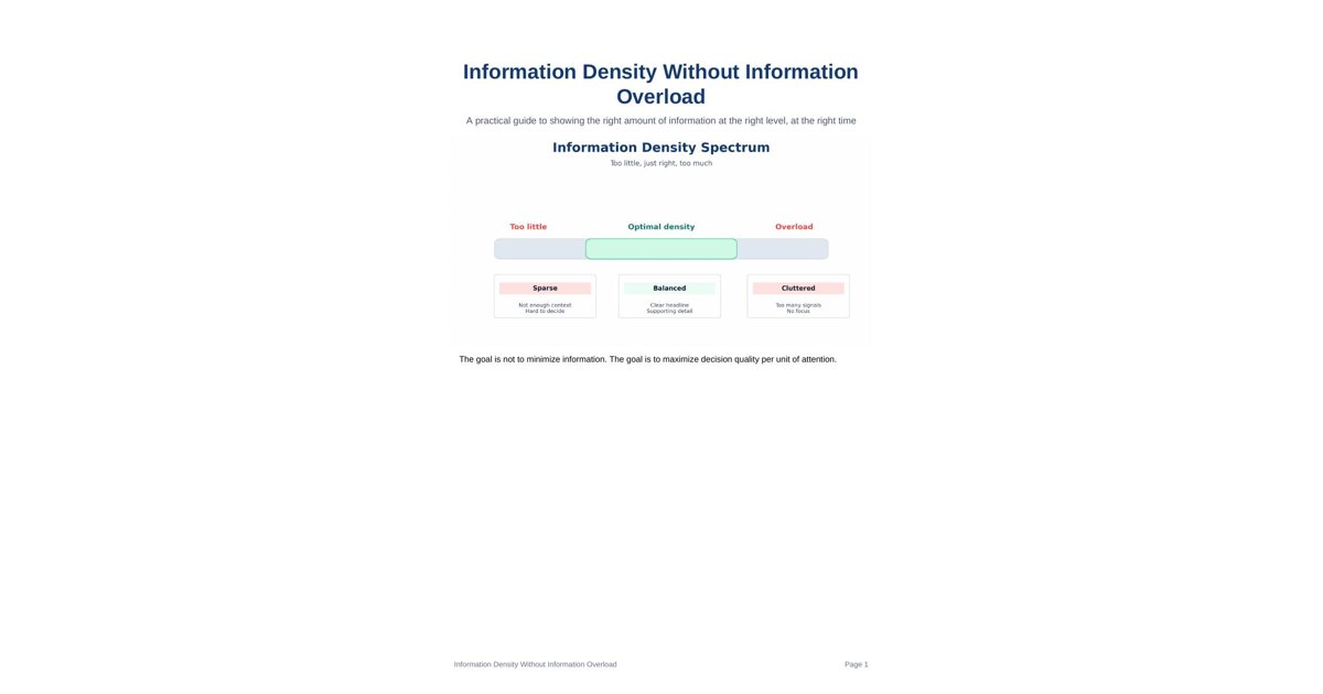
The goal is not to minimize information. The goal is to maximize decision quality per unit of attention.
Information Density Without Information Overload Page 1
1. The core tradeoff Good information design lives in a narrow band between silence and clutter. If you show too little, people cannot understand the situation. If you show too much, people spend their attention decoding the page instead of making a decision.
The sweet spot is not a fixed number of charts or words. It depends on the audience, the decision, the frequency of use, and the cost of being wrong.
A useful rule is simple: every element must earn its place. If it does not clarify, compare, or trigger action, it is probably noise.
Information Density Without Information Overload Page 2
2. The density framework
Progressive disclosure is the best default model for dense information. Start with the summary, then let people move into the supporting context, and only then expose the row-level detail.
Layer What it should contain What to avoid
Summary A small set of KPIs, status, and direction All raw metrics and every exception
Context Trends, comparisons, drivers, and notes Long explanations that repeat the chart
Detail Supporting tables, drill-downs, source rows A second summary page that copies the first The best dense systems do not hide detail. They delay it until the reader asks for it.
Information Density Without Information Overload Page 3
3. Attention is a budget
Every chart, label, icon, filter, and footnote spends some of the reader’s cognitive budget. Charts usually cost the most, text and control elements also cost attention, and whitespace helps the reader recover between decisions.
This means your layout should be intentional. Use layout to guide the eye, not to decorate the page.
Element Typical attention cost Use it when
Chart High It changes the decision
KPI number Medium It answers a direct question
Text label Low to medium It clarifies meaning
Filter or control Medium The user needs to change the view
Whitespace Negative cost It separates and calms
Information Density Without Information Overload Page 4
4. Rules that keep density healthy • One screen, one main job. If a page tries to answer three different problems, it usually answers none well.
• Use hierarchy. Make one thing dominant, a few things supporting, and everything else subordinate.
• Bundle related items. Do not spread the same concept across unrelated corners of the page.
• Remove duplication. If the same number appears in the title, chart, and table, ask whether it needs to appear in all three.
• Prefer comparison over lists. People understand change faster than isolated facts.
• Delay detail. Add drill-downs, tooltips, or secondary pages instead of crowding the first view.
A dense dashboard is not necessarily a bad dashboard. A dense dashboard with no visual hierarchy is the problem.
5. Common anti-patterns Pattern Why it hurts
Too many equal-weight charts The eye does not know where to start
Walls of text The reader has to decode before acting
Overuse of color Color loses meaning when everything is highlighted
Repeated numbers everywhere The page feels busy but not informative
Filters without context The user can change the view but cannot interpret it If every element is trying to get attention, none of them actually get it.
Information Density Without Information Overload Page 5
6. A reusable density recipe A reliable pattern for dense but readable information is: define the audience, choose the decision, select 3 to 5 KPIs, add one layer of context, then reveal detail on demand.
Step Action Output
1 Define audience Who is reading this and what do they need to decide?
2 Choose decision What choice should the page support?
3 Select KPIs A small set of signal-rich measures
4 Add context Trends, comparisons, and drivers
5 Reveal detail Secondary tables, tooltips, drill-downs This recipe works because it treats attention as the scarce resource and clarity as the objective.
Information Density Without Information Overload Page 6
7. What good looks like Audience Good density pattern Example
Executive Three KPIs, one trend, one note on why Revenue, margin, churn, with a short commentary
Manager KPIs plus root cause breakdown Target, variance, drivers, owner
Analyst Dense tables behind a clean summary Summary page plus drill-down table
Good density feels calm. The reader knows what matters first, and the rest is available when needed.
Information Density Without Information Overload Page 7
8. Final checklist before publishing • Can the reader explain the page in one sentence?
• Is one item clearly more important than the rest?
• Have you removed duplicated labels and redundant metrics?
• Does the page answer a real decision?
• Are details available on demand instead of crowding the main view?
• Would a new reader know where to look first?
If the answer to most of these is yes, the page is probably dense enough without being overloaded.
Bottom line Information density without overload is not about showing less. It is about showing the right things in the right order, so the user can think quickly, act confidently, and drill down only when needed.
Information Density Without Information Overload Page 8